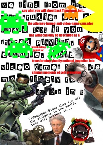
A typography poster I made. Concept behind it? Well I had to "deconstruct" an idea I disagree with. Can you guess what idea I disagree with? Do you even know what the hell is going on? Took me about an hour to make in photoshop. Thought about sharing it, and yeah....new blog entry.

JakBaronKing
Your typography sucks....
I know you can do better...it looks like a ransom letter combined with your favorite video game characters and the person you hate.
This is a better example.
<a href="http://www.youtube.com/watch?v=0N-c8MIFvaI">http://www.youtube.com/watch?v=0N-c8M IFvaI</a>
azteca89 (Updated )
Dude....didn't need to say it sucked. Could of simply said, needs lots of improvement. Also...You also missed one..little...thing...Deconstucti on poster. The point of the poster is to simply "deconstruct" an idea you don't agree with. I never said that I hated Jack Thompson himself, I am disagreeing with his ideas about videogames cause violence that lead to those school shootings just recently. The type didn't really matter for this project. I don't make my type, just yet.
Here's a little example of Deconstruction:
http://alexpines.com/blog/wp-cont ent/uploads/2008/04/poster_study1 1.jpg